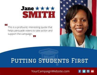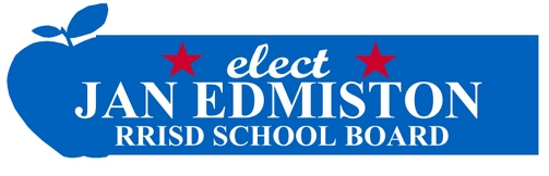
A school board campaign logo is the main visual treatment of the candidate’s name. It will appear on signs, literature, mail, social media, the campaign website, and other advertising.
The logo doesn’t need to explain the entire campaign. It needs to help voters recognize the candidate’s name and understand which office the person is seeking.
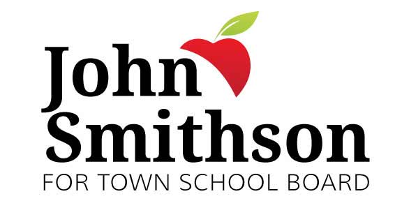 For most local campaigns, a simple design works better than one filled with slogans, school symbols, dates, district details, and several typefaces. Voters may see the logo for only a few seconds on a roadside sign or while scrolling through a social feed.
A school board campaign logo should:
- Make the candidate’s name easy to recognize
- Identify the office clearly
- Remain readable at large and small sizes
- Use a limited number of fonts and colors
- Work on signs, print material, websites, and social media
- Be supplied in formats suitable for both printing and online use
Online Candidate school board website packages include a custom campaign logo and website header. High-resolution logo files are provided for signs and other printed campaign material.
Start With the Candidate’s Name and Office
The candidate’s last name is usually the largest part of the logo because that’s the name voters need to recognize on the ballot. The first name can be smaller, particularly when the last name is distinctive.
The office can appear underneath or beside the name:
- For School Board
- Board of Education
- School Board, District 3
- Board Trustee, Area 2
Use the official or commonly understood name of the office. Confirm the district, seat, position number, or trustee area before approving the design.
A district may formally call the governing body the “Board of Education,” while most residents refer to it as the “School Board.” Either term may work, but the wording shouldn’t leave voters unsure about which race the candidate is entering.
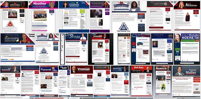
Political Logo Design Samples
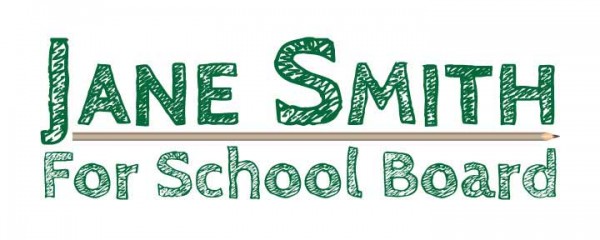
See the full political logo design gallery and our downloadable political logo templates.
Keep the Design Simple and Readable
A useful campaign logo includes only what voters need to identify the candidate and the race.
Common problems include:
- Several unrelated fonts
- Long slogans
- Too many colors
- Multiple symbols competing for attention
- Office or district text that’s too small
- Thin lettering that disappears at a distance
- Busy backgrounds behind the candidate’s name
A design may look fine when it fills a computer screen and still fail when it’s reduced to a social profile image or printed on a roadside sign. Test it at the sizes the campaign will actually use.
The core logo doesn’t need to include the election date, website address, campaign disclaimer, endorsements, or every town in the district. Those details can be added to the final sign, mailer, or social graphic without becoming part of the logo itself.
Choose Fonts That Voters Can Read Quickly
Serif and sans-serif fonts can both work for a school board campaign. The important issue is whether the candidate’s name remains clear when someone sees it from a distance or at a small size.
One or two font families are enough for most logos. Using several typefaces can make the design look pieced together and weaken the emphasis on the candidate’s name.
Be Careful With Script Fonts
Script or handwritten lettering may fit a particular campaign style, but it’s usually a poor choice for the main candidate name.
Script fonts can be difficult to read:
- From a moving vehicle
- On a small social graphic
- When printed at low quality
- When several letters connect
- When the candidate has a long name
A decorative font isn’t helping if voters can’t read the name quickly. If the campaign wants a handwritten element, use it as a small accent rather than for the main text.
Check Letter Weight and Spacing
Use lettering that’s thick enough to remain visible when printed or reduced. Check the spacing between letters, especially when the name appears in all capital letters.
Don’t stretch, compress, outline, or add heavy shadows simply to force a long name into one line. It may be better to place the first and last names on separate lines or adjust the overall layout.
Choose a Limited Color Palette
A school board campaign doesn’t have to use the red, white, and blue combinations common in larger partisan races.
Color ideas may come from:
- Local school or regional colors
- A restrained version of a specific school-related colors
- Colors that reproduce well in print
- A combination that differs from other candidates in the race
Using school or district colors can create a local connection, but it can also make campaign material resemble an official district notice. Don’t copy the district’s branding or create the impression that the school system has endorsed the candidate.
The text and background need enough contrast to remain readable. A subtle color combination may look attractive on a monitor but become muddy when printed or viewed from the road.
School Symbols Are Optional
School board campaign logos sometimes include an apple, book, pencil, graduation cap, school building, or similar symbol.
A symbol can help identify the type of race, but the words “School Board” or “Board of Education” may already do that. In many cases, the candidate’s name and office are enough.
If you include a symbol:
- Keep it simple
- Make sure it remains recognizable at small sizes
- Don’t let it overpower the candidate’s name
- Use artwork the campaign has permission to reproduce
- Check how it looks in black and white
Don’t Copy Official School Branding
A district seal, school logo, mascot, building photograph, or other official image may be restricted or may suggest that the district supports the candidate.
Check the district’s policies before using official artwork. When permission isn’t clear, use an original design or properly licensed graphic instead.
The same rule applies to parent organizations, unions, nonprofits, political parties, and community groups. Don’t place an organization’s logo in campaign material unless its use has been approved.
Keep Slogans Secondary
A short slogan can be included in a campaign logo, but it shouldn’t compete with the candidate’s name or make the design difficult to read.
Examples of short formats include:
- Experience for District 3
- Planning for Our Schools
- Clear Budgets. Better Communication.
- Students. Schools. Community.
See more school board campaign slogan ideas.
Design for Signs, Print, and Online Use
A logo shouldn’t be designed only for the campaign website. It will need to work in several shapes and sizes.
Common uses include:
- Horizontal yard signs
- Vertical flyers and palm cards
- Postcards and direct mail
- Wide website headers
- Square social profile images
- Email headers
- Digital advertisements
The layout may need to change for each format. A wide sign and a square social image can’t use the exact same arrangement. The name treatment, fonts, colors, and overall style should still look like the same campaign.
Before approving the logo, place it into a sample yard-sign design. Check whether the candidate’s name and office can be read at a realistic size.
The completed sign may also need a website address, district number, disclaimer, union-printing label, or other required wording. Those elements should be added to the sign layout without crowding the core logo.
Review campaign sign planning for school board elections.
Use the Same Branding Throughout the Campaign
Once the campaign approves the logo, fonts, and colors, use them consistently on the website, signs, mailers, social graphics, email, fundraising material, and event announcements.
Consistency doesn’t mean every item must look identical. It means voters should be able to tell that the pieces belong to the same candidate.
Don’t redesign the campaign halfway through the race because someone suggests a different font or color. Make a change when there’s a real problem, such as poor readability, incorrect office information, unauthorized artwork, or a design that can’t be reproduced properly.
Ask for Print and Web Files
A small JPG or PNG may work on the campaign website but become blurry when enlarged for a sign, banner, or direct-mail piece.
Ask the designer for:
- A vector or scalable version for professional printing
- A high-resolution print file
- A transparent PNG for websites and social graphics
- Versions for light and dark backgrounds
- A black-and-white or one-color version
- The font names
- The campaign color values
Professional formats may include AI, EPS, SVG, or print-ready PDF. PNG and JPG files are useful for everyday online use, but they shouldn’t be the campaign’s only copies. When we design websites for Online Candidate clients, we’ll provide the high-resolution file to the client.
Some less experienced designers (like web designers) might only work in low-resolution file. That can be a problem.
Store your original the files in a campaign-controlled location. That way they will be available if a future printer, designer, sign company, or website provider may need them.
Check the Rules Before Printing
Campaign rules may regulate disclaimers, committee names, union labels, official emblems, sign dimensions, and other political advertising.
The core logo may not contain every required item, but the final sign, mailer, advertisement, or website may need additional wording.
Confirm those requirements before placing a large order. Correcting a digital design is much easier than replacing signs or brochures that have already been printed.
What We See Candidates Get Wrong
Online Candidate has created political campaign websites and logos for local candidates since 2004. Most logo problems aren’t caused by a lack of creativity. They come from poor readability, missing files, inconsistent use, or designs that were created for only one format.
- Making the slogan larger than the candidate’s name. The message is visible, but the candidate isn’t.
- Putting too much into the logo. It includes the office, district, slogan, election date, website, and disclaimer.
- Designing only for a computer screen. Thin lettering and small details disappear on signs and printed material.
- Receiving only a small image file. The campaign later learns that it can’t be enlarged without becoming blurry.
- Letting the designer keep the source files. The campaign has to return to the same person for every new use.
- Using different colors and fonts across materials. The website, signs, mailers, and social graphics don’t look connected.
- Using official school artwork without permission. The design may imply district support or violate a policy.
- Approving the logo before confirming the race. The design contains the wrong district, seat, or office wording.
We also receive logos copied from screenshots or social profiles because no one knows where the original file was stored. (Ugh!) Obtain the source and print files when the design is completed, not when a printer asks for them weeks later.
Related School Board Campaign Guides
- Choose a school board campaign slogan
- Plan your campaign signs
- Use school board Canva templates
- Plan your campaign website
- Choose a campaign domain name
Campaign Website and Logo Design
Online Candidate school board website packages include a custom campaign logo and website header. High-resolution logo files are provided for signs and other printed campaign material.
View School Board Campaign Website Options